Distinct and Dynamic: How Origo Helped Aspyr Craft a New Brand Identity
September 30, 2024
Recently, Origo Branding was honored to partner with the Workforce Development Board of Central Ohio to create a new brand strategy. We developed the new and impactful name of Aspyr to capture the energy and values of the organization, while also matching it with a striking visual identity and cohesive tactical strategy to connect with its different audiences.
Being a part of this brand coming to life has been a rewarding experience as it reflects its unique mission and enhances its ability to speak to its many offerings to the different communities it serves.

Crafting a Name that Inspires and Resonates
What’s in a name? It turns out, quite a lot when it comes to marketing and branding. Names serve not only as a way for the public to recognize an organization but also as a true reflection of its identity. When we undertake a naming project, we painstakingly brainstorm and ideate until we come up with the perfect word or pairing that exemplifies our partners’ essence.
Aspyr is Central Ohio’s premier source of workforce information, resources, and information, driving our region’s economy toward greater heights. It had previously been known as the Workforce Development Board of Central Ohio.
While the former name was informative, it lacked an ownable identity and didn’t inspire a sense of possibility. Together, our teams came up with the new name, Aspyr, which was a modern take on the word “aspire,” and instilled a sense of inspiration and curiosity for the future of Central Ohio’s workforce ecosystem.

Designing Visuals that Capture and Evoke Emotion
Logos are not just fonts and color palettes. They’re absolutely crucial to a brand’s identity and recognition. A quality logo should showcase the intangible benefits of the brand and evoke powerful feelings or emotions. As a result, target audiences can have a deeper connection and understanding of what the organization really stands for.
Well before its new name, Aspyr had identified itself as the region’s nexus of workforce strategy and innovation. As such, its logo needed to convey a sense of connection, leadership, and influence.
The new logo was partially representative of the “A” in Aspyr while also showcasing the upward momentum it brought to the region, using bright yellow, peach, and orange hues with a modern spirit. The result was a logo that inspired positivity while standing out from the norm of other governmental organizations.

Developing Tactics that Facilitate Clear and Creative Communication
A new name and logo will only get a brand so far without an implementation plan. Establishing one helps a brand gain greater recognition and continuity. A good implementation plan runs the communication gamut, from emails and social media posts to videos and digital tactics.
As an organization relying on cross-industry collaboration, the Aspyr team regularly networked and spoke at events. Since Aspyr always participated in communicating in-person with its audiences, its collateral needed to be geared toward those endeavors.
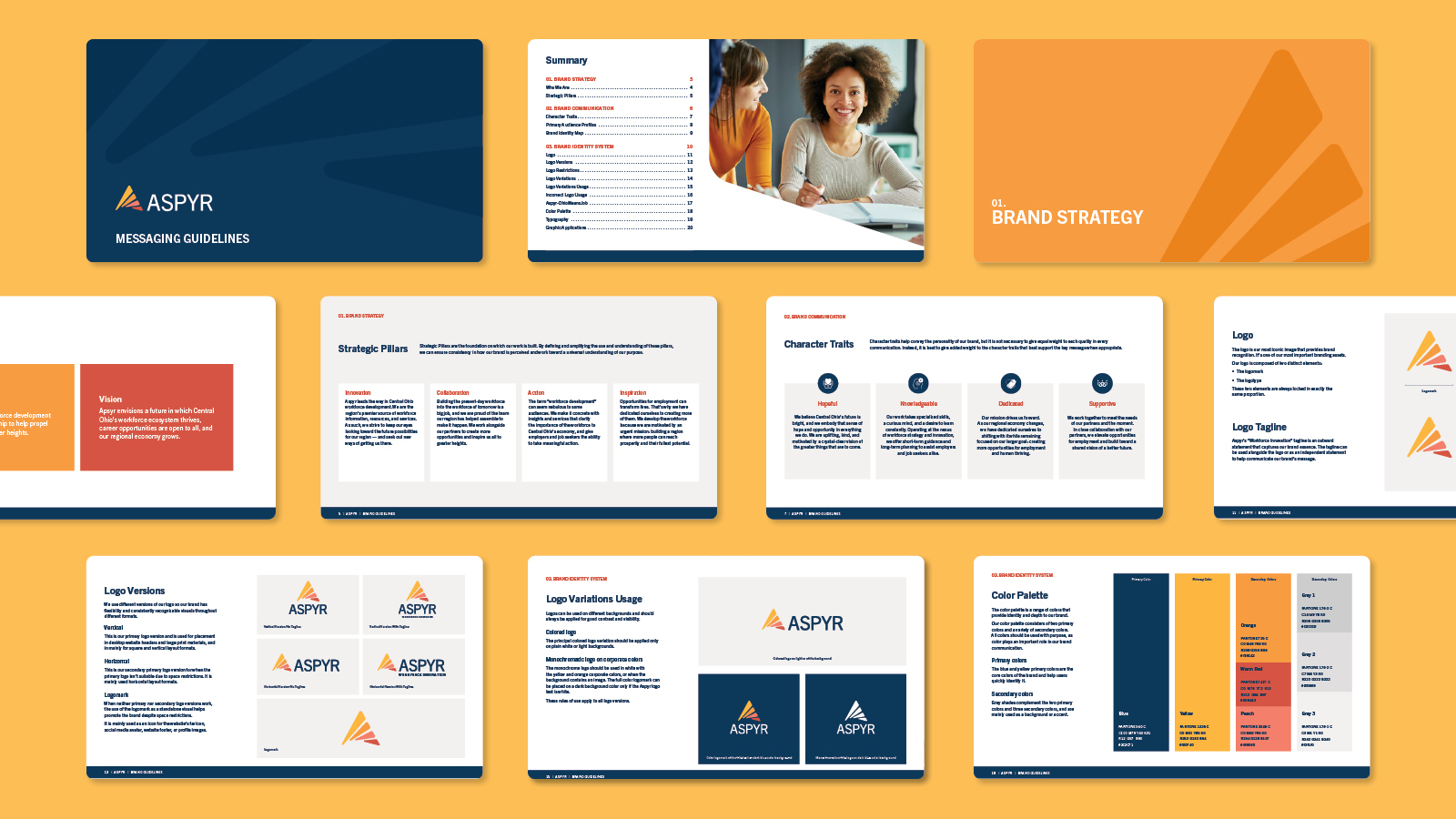
To help, we created branded folders, letterhead, business cards, case study templates, and more for the team to effectively communicate its benefits to current and potential partners.
A Bright Future for an Ohio Organization
Now, Aspyr has a distinct identity that highlights the unique services and support that this organization offers to Ohioans. Origo is proud to have partnered with them and looks forward to seeing how they continue to grow and evolve in the future.